This article is a map of the Minuvox dashboard: what each section is called, where it sits, what it literally displays, and what filters act on it. It is not an interpretation guide – for “is a growth arrow good news?” questions, How to Read Your Salon Dashboard and Spot Business Trends is the companion article designed to sit next to this one. It is also not a setup guide – if your dashboard is empty because you have not added services, clients, or bookings yet, How to Set Up Online Booking for Your Salon is the walkthrough. This article assumes you are logged in, the dashboard is loading, and you want to know what you are looking at.
Where the Dashboard Lives
The dashboard is the default page after you log in, and it is also reachable from the sidebar link labelled Dashboard. Every logged-in user on your account sees a dashboard for your company, scoped to your company’s data only – no staff member sees another company’s numbers. The layout is the same for everyone; only the personal default time period differs between users.
The Anatomy of the Page
From top to bottom, the dashboard has seven regions. Holding this mental picture saves scanning time when you return to find a specific number.
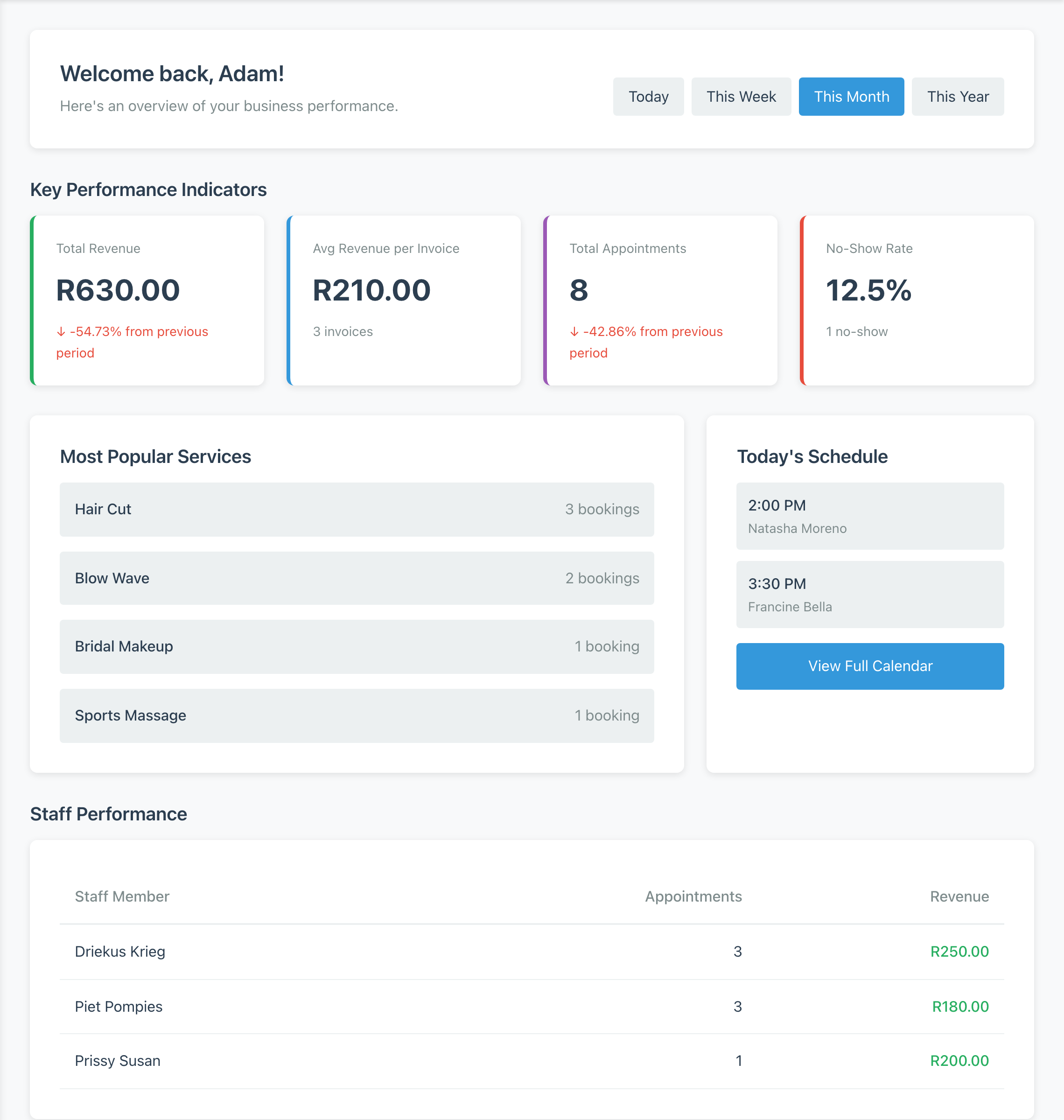
At the top is a welcome message with your first name. Immediately below is the time period selector. Below that, under the heading Key Performance Indicators, is a row of four KPI cards: Total Revenue, Avg Revenue per Invoice, Total Appointments, and No-Show Rate. Next is a Revenue Goals section, only present when a goal has been configured. Below that, Most Popular Services sits on the left of its row and the Today’s Schedule widget sits on the right. Spanning the full width beneath them is the Staff Performance table. Finally, if your setup is not yet complete, a Quick Actions box and a Getting Started checklist appear at the bottom.
The Time Period Selector
Immediately under the welcome message is a row of four pill-shaped buttons: Today, This Week, This Month, and This Year. Those are the only four options, and the selected one is highlighted in blue while the others sit on a light grey background.
The first time you load the dashboard, it shows the period stored as your personal default in your user preferences. If you have never set a personal default, it falls back to This Month. Clicking a button reloads the page with the ?period= query parameter in the address bar set to the chosen value, which is how Minuvox remembers which period is currently selected if you refresh or bookmark the page.
Every panel below the selector re-renders against the new period: KPI cards recalculate, Most Popular Services re-sorts, Staff Performance re-counts, Revenue Goals progress bars update. The selector is a read-only filter – it never changes any underlying booking or invoice, only which records the dashboard is counting. For a routine that uses this control as a trend-spotting habit, see the interpretation guide.
The Four KPI Cards
Below the time period selector is a row of four cards, left to right. Each card has a short label, a large number, and a supporting line of text below that. The four cards do not all behave the same way.
Total Revenue (leftmost) shows the sum of your paid invoices for the selected period. Below the number is a growth indicator: an up arrow with a green percentage when revenue is higher than the previous period, a down arrow with a red percentage when lower, or the text “No change from previous period” when they match.
Avg Revenue per Invoice shows total revenue divided by the paid invoice count. This card does not show a growth arrow; instead, its supporting line shows the raw paid-invoice count, for example “12 invoices”, which is the denominator that produced the average. Draft, issued, and void invoices are not in the calculation. For how an invoice reaches a Paid state, see How to Create Professional Invoices for a Service Business.
Total Appointments shows the count of bookings in the period, regardless of status, with a growth arrow in exactly the same format as Total Revenue.
No-Show Rate (rightmost) shows the share of bookings in the current period marked No Show, as a percentage rounded to two decimal places – so a rate of 3/22 bookings appears as “13.64%”, and a clean rate appears as “10.0%” or “0.0%”. Its supporting line shows the raw no-show count, for example “2 no-shows”. This card does not show a trend arrow; the figure is always the current period’s rate, not a comparison.
Each growth arrow’s “previous period” is a fixed pairing: Today compares to yesterday, This Week to last week, This Month to last month, This Year to last year. What any of the numbers or arrows mean for your business belongs in the interpretation guide; this article stops at the description.
Revenue Goals (When Configured)
Between the KPI cards and Most Popular Services sits the Revenue Goals section. It is only present when at least one revenue goal has been configured for your account, and goals are currently set up by an account administrator through internal administration, not through a self-service form. If you do not see this section, no goals are configured.
When present, the section shows up to two progress cards: a Monthly Goal card and a Yearly Goal card. Each card displays the actual revenue for the period, the target alongside it, a horizontal progress bar, and a percentage-complete line. When a goal is reached, the progress bar turns green and a “Goal achieved!” marker appears next to the percentage.
Most Popular Services
Below Revenue Goals sits Most Popular Services, on the left of its row. It shows up to five services, ranked by booking count in the selected period, displayed as the service name on the left and a booking count on the right (“3 bookings”). Bookings marked Cancelled or No Show are excluded, so the ranking reflects bookings that actually took place rather than every calendar entry.
The ranking is by raw booking count, not by revenue – a lower-priced service booked often will sit above a higher-priced service booked once. If fewer than five of your services have bookings in the period, the panel shows only as many rows as you have; it does not pad to five. If there are no bookings in the period at all, the panel does not appear on the page.
Today’s Schedule
To the right of Most Popular Services – or taking its place when Most Popular Services is not rendered – is the Today’s Schedule widget. It shows up to five upcoming appointments for today only, starting from the current moment, with Cancelled and No Show bookings excluded. Each row shows the appointment time and the client’s name beneath it.
At the bottom of the widget is a View Full Calendar button that links to the full calendar page. This article does not describe the calendar page itself; every mechanic of the Day, Week, and Month views belongs in the companion reference Mastering the Minuvox Calendar: Day, Week, and Month Views. Follow the link on the widget – or the article link above – to reach the calendar page itself.
The widget is strictly today-only: it never shows yesterday’s appointments and never shows tomorrow’s. If there are no more upcoming bookings after the current time, the widget shows the message “No upcoming appointments today” above the View Full Calendar button. Unlike Most Popular Services and Staff Performance, Today’s Schedule always renders, even when empty.
The Staff Performance Table
Beneath the Most Popular Services / Today’s Schedule row, spanning the full page width, is the Staff Performance table. It has three columns – Staff Member, Appointments, Revenue – and one row per staff member with at least one non-cancelled, non-no-show booking in the period. The table is sorted by the Appointments column in descending order, so the staff member with the most appointments sits at the top.
The Appointments column counts the staff member’s booking items in the period, excluding Cancelled and No Show. The Revenue column sums paid invoice items attributed to that staff member in the same period. A booking taken but not yet invoiced adds to the appointment count while leaving the revenue column at zero, and an invoice that exists but is not yet marked Paid does not contribute to revenue. The column measures paid revenue, not work performed.
If you run a solo practice, the table is a single row – your own. For how staff members are added and assigned, Staff Scheduling for Small Service Businesses is the setup reference.
What a Week-One User Sees
On a fresh account – before real bookings, real invoices, and real clients – the dashboard still loads. The welcome message and the time period selector are present regardless of data, and the four KPI cards render with zero values: Total Revenue and Avg Revenue per Invoice show your currency symbol followed by 0.00, Total Appointments shows 0, and No-Show Rate shows 0.0%. The no-show figure is not an error – the analytics engine explicitly returns zero when there are no bookings in the period, so an empty week will not break the dashboard. Growth arrows are neutral when both the current and previous periods are empty, so you will not see a misleading “up 100%” spike from nothing.
A fresh account will not see the Revenue Goals section, the Most Popular Services panel, or the Staff Performance table. These panels are hidden when there is nothing to display rather than rendering empty shells, so the page shortens: the KPI row sits directly above the Today’s Schedule widget. Today’s Schedule is the exception that always renders; on a fresh account it shows “No upcoming appointments today” above the View Full Calendar button.
The final piece is the Getting Started checklist, which appears at the bottom only when your setup is incomplete – when any of services, clients, bookings, or preferences is still missing. The checklist shows five items. The first row, Company registered, is ticked automatically the moment your account is created, so you will never see it as a pending step. The remaining four – Add services, Add clients, Create first booking, Configure preferences – each show a green tick when done or an open circle with a blue link when still outstanding. Alongside it, a Quick Actions box shows three shortcut links. Once the four actionable steps are complete, the whole Getting Started and Quick Actions row disappears.
This section is about what is on screen, not about when to look at it. For a day-by-day onboarding rhythm, Your First Week with Minuvox is the six-day guide.
What You Cannot Find on the Dashboard
A reference article is as useful for telling you what is absent as for what is present. Five things you may expect to find on the dashboard are not there in v1.6.3.
No graphs or charts. Every metric is a number, a percentage, or a table row – no line, bar, or pie charts anywhere on the page.
No per-client booking history. No panel shows “this client’s past appointments”. Client history lives on the client detail pages; see How to Build and Manage Your Salon Client Database.
No full booking status breakdown. Minuvox tracks seven booking statuses internally – Scheduled, Confirmed, Arrived, In Progress, Completed, Cancelled, No Show – but the dashboard surfaces only the no-show count and rate. The other five are counted in the background and not displayed.
No revenue-by-service or revenue-by-staff drill-down. The analytics engine computes both breakdowns, but neither is rendered on the dashboard, and there is no click-through from a KPI card into a service- or staff-level view.
No widget customisation or compact mode. Your account preferences have fields for visible widgets and a compact layout, but neither is exposed in the dashboard UI in v1.6.3. Only the default time period is user-controllable.
A Snapshot, Not an Analysis Tool
The dashboard tells you where your numbers are right now for the period you have selected. It does not tell you what the numbers mean. For interpretation – “is my no-show rate a problem?”, “what does a dropping growth arrow mean?” – the dashboard interpretation guide is the companion to this article. For the first-week rhythm that fills the dashboard with real data, Your First Week with Minuvox has the day-by-day plan. For the calendar page that Today’s Schedule links out to, Mastering the Minuvox Calendar: Day, Week, and Month Views is the dedicated deep-dive. For setup detail on any panel, How to Set Up Online Booking for Your Salon is the walkthrough, and the broader feature set covers what Minuvox does beyond this page.
Open the dashboard in a second tab and work through this article top to bottom, naming each region as you find it. By the end you will know the page well enough to locate any number without hunting.
About the author: Adam Claassens is the founder and developer of Minuvox. He wrote the dashboard view, the analytics engine, and every panel described in this article, which is why the labels, limits, and behaviours here match how the product actually behaves. Minuvox exists to make professional booking tools accessible to small service businesses that cannot afford expensive monthly subscriptions.