Once your services, staff, and bookings are configured, the calendar is the page you will spend the most time on. It has three views – Day, Week, and Month – and switching between them is one click. Each view is shaped for a different kind of decision, and knowing which one to open when is the difference between feeling fast in the calendar and feeling slow.
This article walks through what each view is for, how to move through it, and what you are looking at inside it. It assumes you already have a Minuvox account with real bookings and want to work faster inside it. If you have not yet set up services, staff, or business hours, How to Set Up Online Booking for Your Salon covers those pages, and if you have not yet decided whether to use a digital calendar at all, Still Using a Paper Appointment Book? What You’re Missing is the one to open first.
The Three Views and When to Use Each
A quick decision rule, so you know which view to open first.
Day view is for running the day. Open it when the question in front of you is “what is happening in the next few hours, who is booked, and where are the empty slots I can still fill.” It is the operational view – the one you glance at between appointments.
Week view is for planning the week. Open it when the question is “what does the whole week look like, is anyone overloaded, and where are the gaps across several days.” It is the view you open at the start of the week to set the shape and at the end of the week to see how it landed.
Month view is for looking further out. Open it when the question is “which days are heavy, which days are empty, and where do I have room to take more work.” It is the view for thinking about capacity, not the next appointment.
Switching between the three is one click. The view tabs sit at the top of the calendar page with the active view highlighted. Your last choice is remembered per user, so the view you were on last time is the one that opens next time.
Moving Through a View
Three controls handle navigation and they are the same regardless of which view you are in. Previous (‹ Previous) moves the view backward by one step – one day in Day view, one week in Week view, one month in Month view. Next (Next ›) moves forward by the same step. Today jumps straight back to today’s date regardless of where you had navigated to. If you are three weeks ahead and want to see what is happening this afternoon, one click and you are there.
The current view and date both live in the URL, which means you can bookmark or share a specific calendar state. The date is a ?date=YYYY-MM-DD parameter and the view is a ?view=day|week|month parameter, so a URL like /booking/calendar/?view=day&date=2026-04-20 opens Day view on 20 April 2026 directly. You can pin “next Tuesday’s day view” to a browser tab or send a co-worker a link to the exact day you are looking at instead of telling them to click around.
Day View: Running Today
Day view is a single vertical time-slot grid for the selected date, running from 8 AM to 8 PM. The left-hand column shows each hour, and each hour is divided into slots according to the company’s slot duration setting – 15, 30, or 60 minutes, with 30 minutes as the default. Slot duration is a company setting in Preferences, so everyone on the account sees the same granularity.
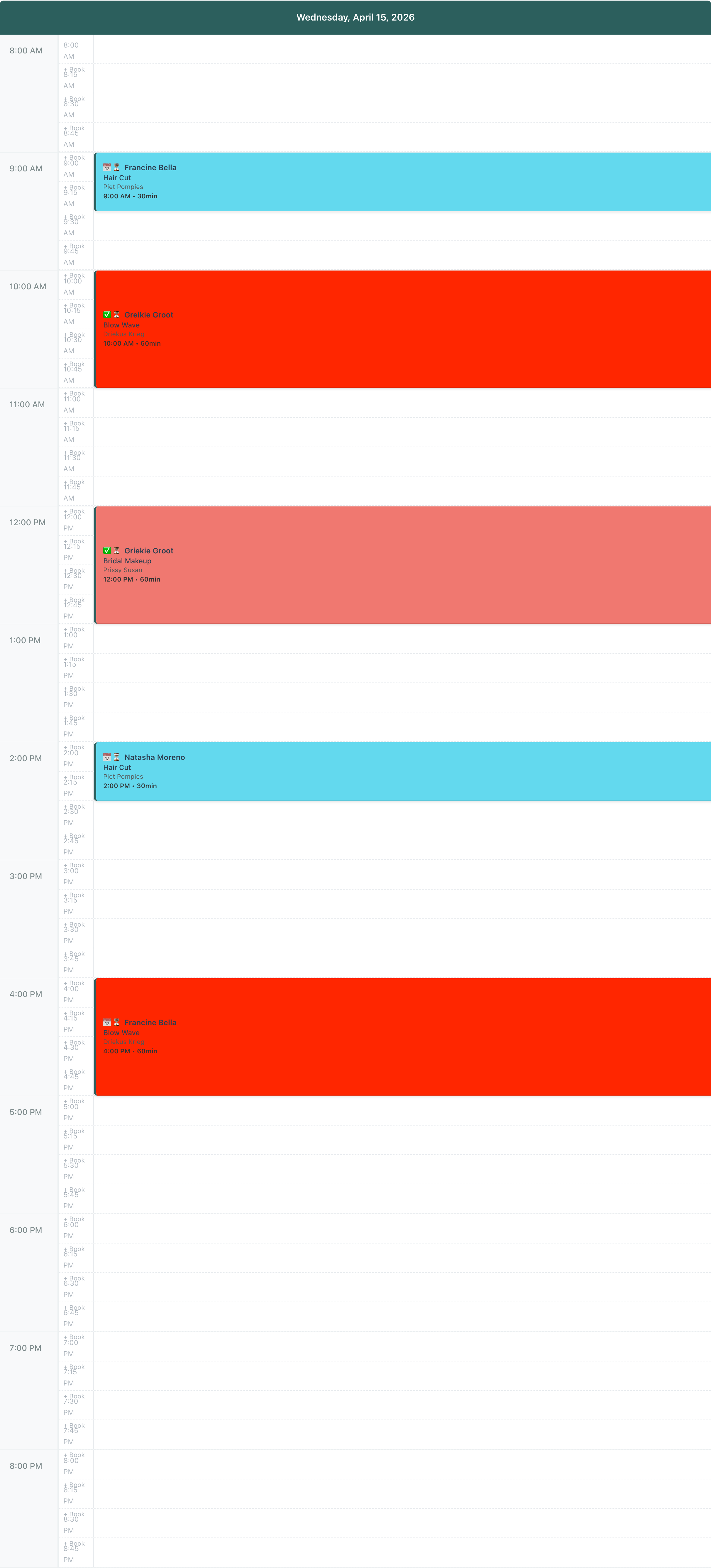
Every empty slot shows a small + Book label. Click the label and Minuvox opens the new-booking form with that exact time pre-filled – no typing the start time, no hunting for it. Creating a booking is one click, not a form field.
Each booking on the grid is rendered as a coloured card that spans its real duration. A 60-minute blow wave is exactly twice as tall as a 30-minute cut. You can see how long each booking takes without reading any numbers, which makes spotting gaps visual instead of arithmetic: if you are holding a 30-minute slot open for a walk-in, you can see at a glance whether there is room for one.
Each card is coloured by service, using the colour you picked when you created the service. Blow waves are one colour, cuts are another, colour treatments are a third. Each card shows the client name, the service, the staff member, the start time and duration, and a status-plus-payment icon pair in the corner (📅 / ✅ / 👋 / ⚙️ / ✓ for scheduled, confirmed, arrived, in-progress, and completed bookings; 💰 when the booking has been paid). Cards stack side-by-side when bookings overlap, so a double-booked slot does not hide anything. A booking that combines multiple services (or multiple clients on the same booking) renders as a stack of coloured segments inside the card, one segment per service – each segment coloured by its own service and labelled with its own client, service, and duration, so nothing is collapsed behind a “+N more” tag.
Three things are hidden from the calendar on purpose, so you know they are not bugs when you do not see them. Cancelled and no-show bookings do not render on any view – the calendar is for forward-looking work, not a historical log. If you need the record (to rebook the client or check what the original appointment was) the Bookings page and the client detail page both show them in full. Blockout times – the “do not book here” zones you set up outside of any appointment – render as grey strips with a 🚫 prefix, so the slots they cover cannot accidentally receive a + Book click. Staff time-off renders the same way, with a 🚫 prefix for blocked time and a 🍽️ prefix for scheduled lunch.
Week View: Planning the Week
Week view is a 7-column grid covering Monday to Sunday, with an hourly left-hand column running from 8 AM to 8 PM – the same hour range as Day view. The view is anchored on the week that contains the date you are looking at, so clicking Next advances you by a full week.
The thing you see first in Week view is the shape of the week. You do not have to click into each day to see whether Tuesday afternoon is stacked while Thursday morning is empty, whether the weekend is capacity you could still fill, or whether one staff member is shouldering a disproportionate share. The shape is immediate – which is why Week view is the right view at the start of the week (to plan) and at the end of the week (to see how it went).
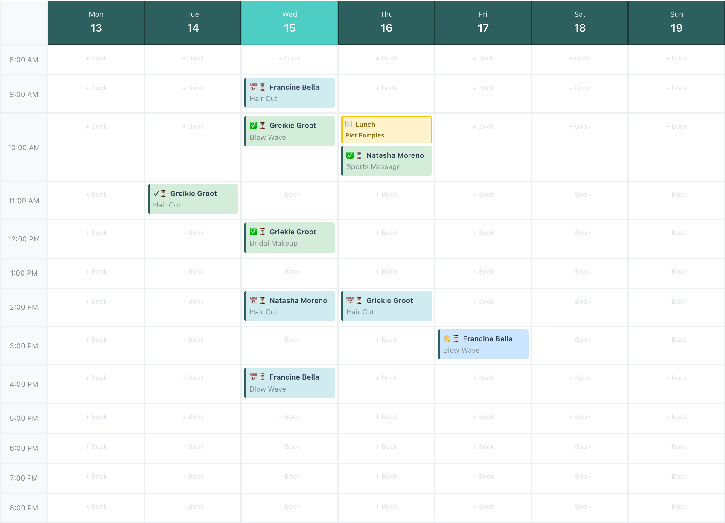
Week view is built for breadth, not for time precision. Each (day, hour) cell is a fixed-size box, and each booking that starts in that hour appears as a small tag parked inside the cell – not as a duration-sized card spanning multiple hour rows. A 90-minute booking that starts at 10:00 shows up as a single tag in Tuesday’s 10 AM cell; it does not stretch into the 11 AM cell the way a Day view card would. Multiple bookings starting in the same hour stack vertically inside that cell. It is the right tradeoff for seeing seven days at once, but if you need to see how long a specific booking actually runs on the grid, switch to Day view for that date.
Each tag shows the status and payment icons, the client name, and the service name. Unlike Day view, Week view colours tags by status, not by service: scheduled is light blue, confirmed and completed are both light green, arrived is medium blue, in-progress is yellow. At seven days of work on a single screen, service colouring is harder to read, so Week view uses status to answer “where does each of these bookings stand” instead of “what is it.” A booking with more than one client shows the first client followed by +N, where N is the number of additional clients on the booking.
If you have multiple staff and want to narrow the view, the Staff filter at the top of the calendar does that. Open the Staff dropdown, tick the staff you want to see, and click Apply Filter – the grid redraws with only those staff’s bookings. The dropdown also has Select All and Clear All shortcuts at the top, so resetting to everyone is two clicks: Clear All, then Apply Filter. The filter persists across sessions if you have auto-save filters on, so you do not have to re-select it every morning.
A (day, hour) cell with no bookings and no blocked time shows a faint + Book placeholder. Click the cell background – empty or populated – and Minuvox opens the new-booking form pre-filled for that day at the top of that hour; change the minute in the form once it opens. Click any booking tag that is already in the cell and Minuvox opens that booking’s detail page instead, so an existing booking is never lost behind a cell click.
Month View: Looking Ahead
Month view is a different shape for a different purpose: a traditional month grid, seven columns (Monday through Sunday) and one row per week. Days not in the current month – the first few at the top and the last few at the bottom – appear in light grey so you can see where the month starts and ends. Today is highlighted with a teal inset border, so you can always see where “now” sits in the month without hunting for the date.
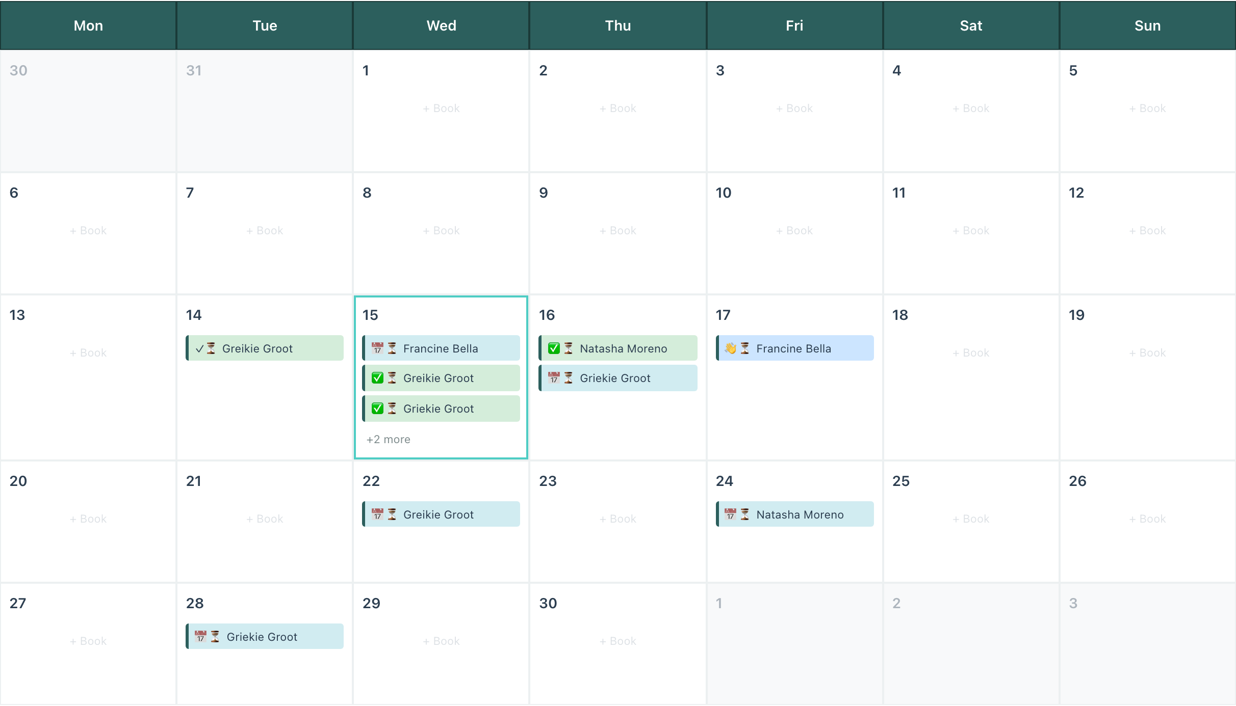
Each day cell holds up to three booking labels, colour-coded by status on the same scheme Week view uses. Cancelled and no-show bookings do not appear, as in the other two views. If a day has more than three bookings, a +N more indicator appears below the three visible ones. Click the day cell to open the new-booking form; click any individual booking label to open the booking detail page.
Day view uses service colours so you can see what each booking is (a cut, a colour treatment, a massage) while running the day. Week and Month view use status colours so you can see where each booking stands (tentative, confirmed, in progress, done) while you are thinking about the week or month as a whole. The views feel consistent once you see the logic.
Empty days in the current month show a light + Book placeholder. Click anywhere in an empty day cell and Minuvox opens the new-booking form with that day pre-filled and the start time defaulted to 9 AM. You can change the time in the form once it opens – 9 AM is a starting point, not a restriction.
Two things Month view deliberately does not show. Staff time-off is omitted because a month-level grid is too coarse to render per-staff daily time-off reliably without cluttering the cells. If you need to see whose time-off is scheduled for a given day, switch to Day or Week view. Time-of-day detail is also omitted – the grid does not show hours, it shows how full each day is. If you need to know whether 2 PM on the 15th is free, switch to Day view for that date.
Calendar Density: How Much You See at Once in Day View
The single preference that changes the most about how Day view feels is density. It is set through the Density dropdown at the top of the calendar and only affects Day view – Week and Month view use fixed cell sizing and do not respond to it, because each of their cells is already a rigid box (one hour in Week view, one day in Month view) that the density setting has no room to stretch or shrink.
Compact density packs more hours into a screen-height at 120 pixels per hour. Use it when you have a lot of bookings or a lot of overlap and you need to see more at once. The tradeoff is that the + Book slots are smaller and harder to click accurately.
Comfortable density is the default at 200 pixels per hour. It is the balance point between “enough visible at once” and “the slots are easy to hit,” which is why it is the default.
Spacious density is the largest at 280 pixels per hour. Use it when you have fewer bookings and want the + Book slots to be easy to click, or when you are on a small screen and need each slot clearly separated from its neighbours.
Density is saved per user, so your choice and a colleague’s choice do not fight. If you ever find yourself squinting at a crowded Day view or missing the + Book slot you were trying to click, change the density – it is one dropdown.
Where to Go From Here
- To set up services, staff, or business hours before the calendar has enough bookings to feel alive, see How to Set Up Online Booking for Your Salon.
- To set up each staff member’s weekly schedule or time-off so the calendar has the right availability rules for every person, see Staff Scheduling for Small Service Businesses.
- To read the dashboard’s view of your booking activity over time (what the calendar is showing aggregated), see How to Read Your Salon Dashboard and Spot Business Trends.
- To get your first week’s rhythm right before the calendar becomes a daily habit, see Your First Week with Minuvox.
One Click, Three Views
Day view for running today, Week view for planning the week, Month view for looking further out. The fastest way to internalise which view is the right answer for which decision is to open the calendar right now and click through Day, Week, and Month on your actual bookings. The shapes are different, the colour rules are different, and each one makes a different question easy. If you find yourself fighting Day view – too much on screen, or too little – change the density. Browse the full feature set whenever something catches your eye that has not come up yet.
About the author: Adam Claassens is the founder and developer of Minuvox. He designed and built the calendar views walked through in this article, which is why the behaviour described here matches how the product actually works. Minuvox exists to make professional booking tools accessible to small service businesses that cannot afford expensive monthly subscriptions.